|
Group
Mason Kirkpatrick & Rose Mayer Background (See Capitalocene Lab #1capitalocene-lab-1-10-22-18.html) The two new capitalocene indicators that I chose were percent urban population and percent forest cover. I chose these indicators specifically because the percent of a countries urban population goes hand in hand with the migration of people moving to urban centers for industrial jobs. I also chose percent forest cover because it directly ties into my concentration because when related to urban growth it demonstrates the relationship between change of habitat and need for more infrastructure. Procedure. First we cleaned our spreadsheets to make sure the data was clear and ordered properly and so that uploading our spreadsheet as a csv to Gis would work. Then we downloaded our new capitalocene indicators from the world bank database. From there we uploaded them as new sheets and merged them with our main sheet so our new data was included in the csv file. We merged another sheet with the two digit ISO codes to our main sheet as well. Additionally, I found the percent change for both of my new indicators over the past decade by subtracting the old value from the current value so I could view the trend. From there we downloaded our sheet as a csv then uploaded it to a map on ArcGis. On ArcGis we were able to display the data comparatively by country on one map. Results When viewing these maps you can see that the global trends for these new indicators. For urban population you can see that on a global area most countries are becoming more urban than before. For forest cover you can see that there is a global decrease in forest cover. View my ArcGis map here (https://arcg.is/1WvO8e) Discussion On very obvious level you can see that countries that experienced a decrease of the past ten years had a worse environmental performance because of the way that deforestation is calculated into ecosystem vitality.. The relationship between urban population growth and ecosystem vitality is rather ambiguous in the sense that there is no direct correlation between the two. On one hand, if more people are moving to urban centers than their impact on the ecosystem vitality could be decreased but they are adding to the whole impact on the city. On the other, urban population growth symbolized an increased industrial demand for labor which in unregulated areas can pollute local ecosystems. The larger implications of the existence of these relationships, or lack thereof, support the idea that the capitalocene is the dictating force and has taken over from the anthropocene. While the argument could be made that these factors support the capitalocene because they are driven by anthropocentric action and thus support the anthropocene. The same argument could be made in favor of the capitalocene by arguing that these human actions are driven by the desire for capital. In conclusion these factors represent and support the capitalocene because they are symbolic of the desire for capital.
0 Comments
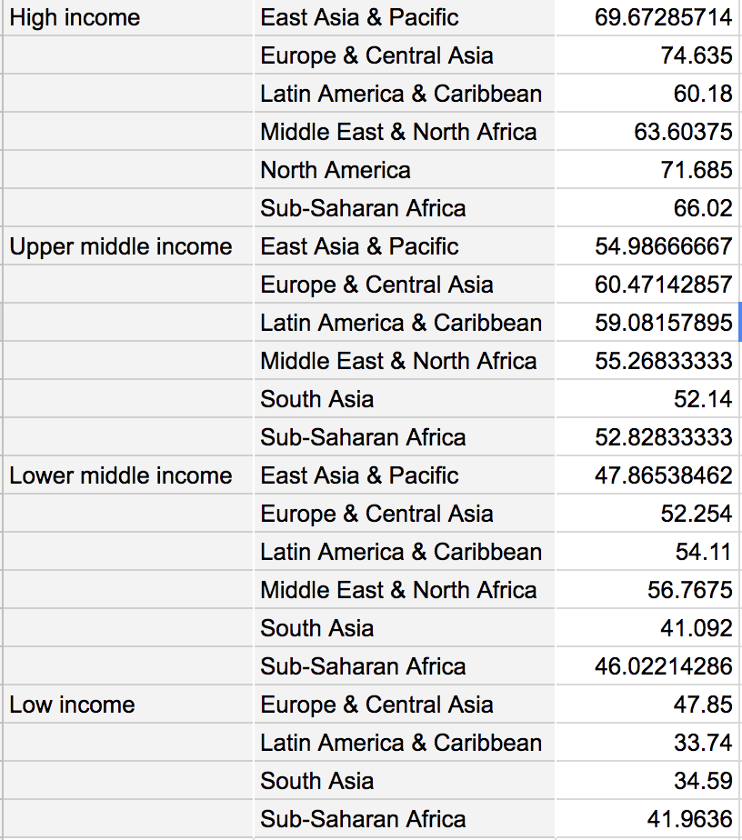
Mason Kirkpatrick & Rose Mayer Background The transition from the Anthropocene to the Capitalocene proposes the idea of leaving the age of man in favor of the age of capital. The global superpowers exhibit late stage capitalist tendencies and the Capitalocene implies that humans themselves are no longer the major players in the health of the global environment. Rather it is the specter of capitalism that has the most influence. While measuring the Capitalocene can provide rather useful information, it also provides some challenges. First, countries that aren’t capitalist or don’t display capitalist tendencies are measured in the same manner as late stage capitalist countries. Additionally, the Environmental Performance Index (EPI) is used to quantifiably measure the performance of a government's environmental policies. This allows wealthier countries to have a greater EPI because they can afford more environmental policies than developing nations. Procedure The first thing that we needed to do for this lab was to merge all of our data onto one sheet which we did by downloading an add on. We made sure that all the data lined up correctly based on region and income group. Once our data was lined up properly we were tasked with calculating the mean and standard deviation for the three main EPI indicators for which we used a pivot table. From there we were able to graph the mean and standard deviation of the EPI indicators by the World Bank income groups and regions. From there we were able to analyze our results.
Results
As it has become abundantly clear, as you increase the level of income of the country and region the Environmental Performance of that area increases as well. When looking at the region, areas with a greater environmental performance are classically viewed as wealthier areas were other regions with lesser environmental performance are viewed as less wealthy. The most significant result is viewing the relationship of the wealth of a country or region with its respective environmental performance and seeing that wealth directly correlates with environmental performance. Discussion The larger implications of what we discovered is that if any global measures were put in place to incentivize nations or regions to increase their environmental performance, then it would heavily favor wealthier nations. This would act counter intuitively to the purpose of raising the global environmental performance because wealthier nations would advance further ahead while less wealthy nations would keep falling behind. Additionally, countries with lower environmental performances are focusing on more specific issues like drinking water and general health and wellbeing of its citizens rather than their global impact on the environment. In my prior post I caught you up to speed on the happenings of my ENVS 220 class as we concluded our investigation into land use and cover change in the area surrounding Lewis and Clark’s Campus. From there we spent week six workshopping both our draft concentration proposals as well as our draft proposals. We eventually submitted our draft concentration proposals. My proposal was titled “Boundaries: Man-made structures influence migratory patterns and habitat sizes of native wildlife” which will serve as an investigation into how man made structure, whether they’re physical or invisible affect migratory patterns and habitat sizes of the animals that interact with them. There is an important distinction between the physical boundaries, which take the form of highways, dams, and other forms of infrastructure, and the invisible boundaries that take the form of legislation. It is also important to note that I need to tie in the concentration to my current major, which is history, so I will be looking at these structures through a historical lens. This is important to me specifically because in ENVS 160 I studied the effects dams have on native salmon populations in the Pacific Northwest for my final project. The information that I found was quite startling and I wished to pursue this idea further. The scope of that project was far too narrow to be an ENVS concentration so I expanded the scope to more more encompassing as well as making it more applicable on a larger scale. By doing so the scope of my research in the future will no longer be limited to just the Pacific Northwest which will free up a lot of sources for me to use because they take place outside of the Pacific Northwest.
Additionally for my concentration, we had to select a number of classes that we could take at Lewis and Clark to supplement our concentration. For these I chose History 239- Constructing The American Landscape because the creation of the landscape and how it had changed historically is important to note when looking at the american landscape in the present. The next class I chose was HIST 261- Global Environmental History because again, I'm looking at this issue through a historical lens and by taking this class I would be able to cover historical areas that history 239 would not cover. The third class is SOAN 305- Environmental Sociology because another aspect of my concentration is looking into how humans create boundaries for themselves within the context of a society so I feel that this class specifically would help cover this. The last class I chose was ENVS- 350 because it is the highest level ENVS course that I need to take for my minor requirements and would provide me with the tools to explore my concentration more thoroughly. Following our draft proposals we went on fall break and in the most recent class we began our introduction to the Capitalocene which we will be exploring for the foreseeable future. This story map is the final summary of our last four labs exploring land use and cover change. In our story map all of our findings and assessments are compiled and compared to the data that the other eleven lab groups had found for the three main areas of interest. These areas being the Lewis and Clark campus, the Collins View Neighborhood, and River View Natural Area. We show the relationship between the data for our area specifically compared to others in an attempt to identify trends and relationships between our areas of interest. Lastly we finally explore what these trends might mean within a larger context on a global scale rather than local.
This being my first synthesis post for ENVS 220 it only makes sense to give some background on what ENVS 220 is. Fundamentally, ENVS 220 is a methods course in which we learn and understand how to do ENVS. For example, we began the class at the start of the semester by reading and analyzing sources that discuss the causes and effects of landscape change. Which we subsequently tied to our labs where we began researching land use and cover change on Lewis and Clark’s campus as well as the surrounding areas, Collins View neighborhood and River View Natural Area. By tieing what were studying in class to what were investigating in our lab research we get a better impression of what doing ENVS is like outside of the collegiate relm.
Additionally, the four question types (descriptive, explanatory, evaluative, and instrumental) sit front and center as we read and discuss sources. For class one day we read a group of articles from the United Nations published in subsequent years outlining the greatest problem areas that face the human race. To go further we looked identified questions for the problems they outlined and discussed in small groups how each question type related to these issues. From the we began working on our concentrations. To start we began by looking at concentrations students had done in the past in order to see how they are structured. Then we chose one of the past concentrations and created questions based off of the question types for the concentration we chose. Later we we tasked with coming up with an idea for our own concentration and finding at least five sources that would support out concentration. We then had to make a draft concentration proposal which we recently received feedback. In the lab aspect of the course we have been examining land use and cover change in the Lewis and Clark area. For the first lab we set up a 90x90m area in which our 30x30m centroid was located. We set up a Kestrel Drop to record temperature and humidity data in our centroid. Over the next couple weeks we also recorded the canopy and group cover data for our centroid as well. We then compiled all of our data for the twelve centroids that other groups had collected so that we were able to graph our data in a way that compared it to the averages of each of the three areas as well as other sites in our area. This series of four labs concluded with each group creating a story map to summarize and conclude our findings for our examination into land use and cover change in the areas surrounding Lewis and Clark’s campus. Group Members: Mason Kirkpatrick & Rose Mayer Background Continuing our investigation into the effects that land use and cover change have on the anthropocene, this lab furthers our analysis of our crowdsourced data that be began working with in Lab #3. Here we are working to create visual representations of our qualitative data as opposed to the graphs we created in the lab prior. Using GIS to conduct spatial analysis of Collinsview, RVNA, and Lewis and Clark’s campus we were able to compare a current image of these areas to historic photographs from 1939, 1961, and 1982. Using ArcGIS online we were able to layer these images over each other to view how that had changed over the course of 79 years. Procedure Using ArcGIS we set a satellite map of Portland as our base map on which to put the rest of our data. Then we uploaded the spatial data to our map from the zip files to our base map so that we could view the separate areas where our research was conducted. We changed the color for each area so it would be easy to differentiate between the areas. We also make the layers transparent so we could see the satellite images underneath. Next, we upload our data from the spreadsheet we made during the previous lab to our map. This put all of the centroids on a map so we could easily see where they were and compare the information of each one as well. We then layered the historical photos from 1939, 1961, and 1982 over our current photo to compare how the areas have changed since each of these years. Results Viewing our data in this format we were able to see a couple noticeable trends. The first being, areas with more canopy cover tend to have higher average humidity. While areas with less canopy coverage tend to have lower average humidity. Lewis and Clark’s campus has gotten less and less canopy coverage as it became more of an urban area. From this the conclusion that can be drawn is that as Collins View and Lewis and Clark’s campus became more populated and urban canopy coverage and high humidity levels left with it. RVNA has remained unchanged during the time these pictures were taken. Discussion
The larger implications of our results and the trends we noticed were as follows. The main trend we noticed in relations to canopy cover and humidity could be used to infer about similar trends on a global scale. If canopy cover and humidity have an inverse linear relationship then we could infer that areas that are experiencing large scale deforestation could be experiencing a change in humidity. The issue with making inferences such as this one is that it would only be accurate in areas with a similar microclimate to portland. It very possible that areas with different climates would also have differences in the relationship between canopy cover and humidity. The issue with collecting data on a local scale is that it is only applicable on a local scale as long as the areas are similar in climate. If we collected data from all types of other climates in different areas of the country and compared them the same way. We would have a more accurate demonstration of how the data relates to each other. Thus we would be able to assess the relationships between the factors that we collected data on. Additionally if we expanded the scope of our research to the Portland metro area we would have more accurate results while maintaining our local approach to collecting data. Group: Mason Kirkpatrick and Rose Mayer Background This lab concludes our investigation of land use and cover change on Lewis and Clark’s campus and within the surrounding areas. Upon completing the first two labs investigating land use and cover change we were to compile all of our data that each of the twelve groups had collected. This lab analyzes this data and allows us to infer what it could show us about land use and cover change in these areas. Our site was one of the four stationed around Lewis and Clark’s campus with our centroid being in the Estate Gardens on the lawn just east of the reflecting pool. 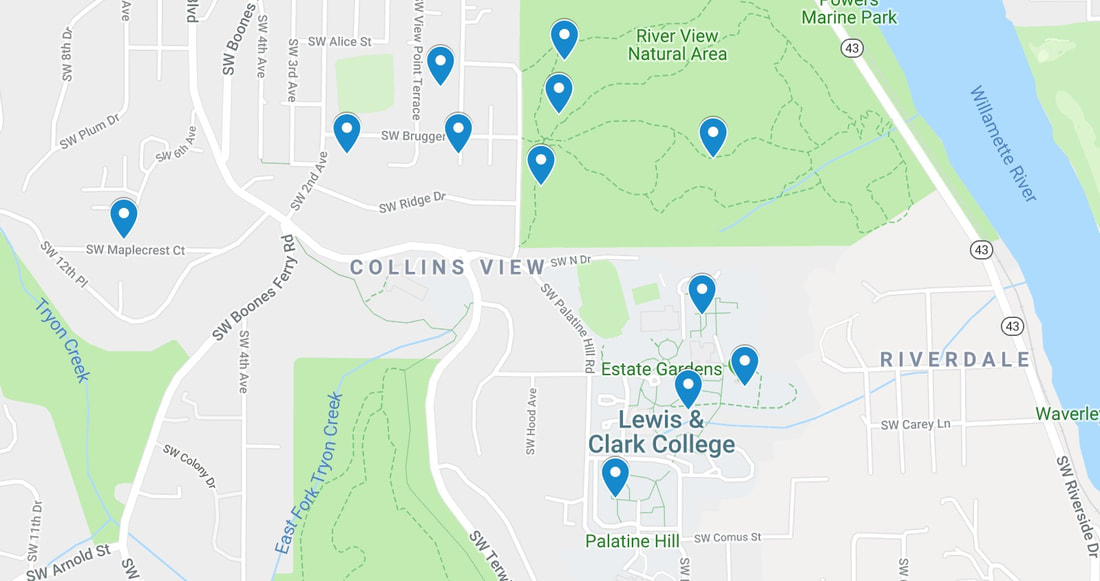 Procedure/Analysis First we compiled all of the lab data from the prior two labs into one spreadsheet. Then we categorized the data from each centroid based on its location (i.e Lewis and Clark campus, Riverview Natural Area, and the Collins View neighborhood). Then we found the ranges for both temperature and humidity for each centroid to add to the detail of our data. From this list of data we created graphs to compare and analyze the data from our centroid to the others on Lewis and Clark’s campus as well as the averages for the entire area. We created a graph to compare our data to the rest of it on the basis of minimum, maximum, average, and range of temperature and humidity. Results We were able to observe that our data most closely aligns with the average data of the Collins View neighborhood as well as Lewis and Clark’s campus. While varying greatly from the average data of Riverview natural area. This make sense because both Lewis and Clark’s campus as well as Collins View are residential areas that experience a good amount of foot traffic. While Riverview is a natural area that is not populated and is protected by the government. The most significant of our findings came in the form of our humidity data. Our maximum humidity was greater than the average humidities of Collins View, Riverview Natural Area, and Lewis and Clark’s Campus. Our minimum humidity was greater than the average humidities of only Lewis and Clark’s campus and Collins View. With our average humidity being less than both Collins View and Riverview but greater than the average humidity of Lewis and Clark’s campus. Finally, our humidity range was only less than Collins View while being greater than the range of the other two areas. This shows us that while our humidity was quite high, there was less of a difference between our minimum and maximum values than that of Collins view. For our canopy and ground cover data, our tallest object was larger than all other areas. Our ground cover was as well because our centroid was in a human maintained area. Thus, the ground was completely covered. We had no canopy cover because our centroid was contained in a large grass lawn with no overhanging trees or shrubbery. 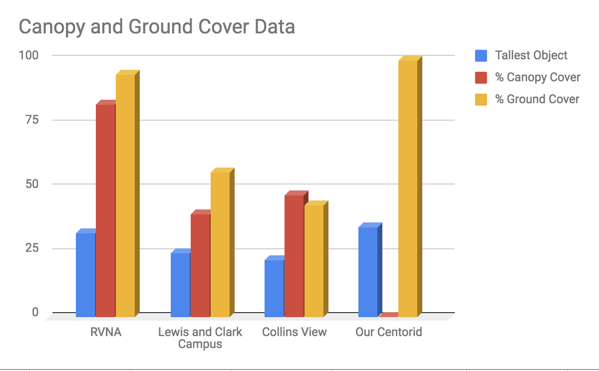 Discussion
The greater significance of our data displays how much values like humidity and temperature as well as ground and canopy cover can vary greatly over a small area. On campus other centroids were only a couple hundred meters from ours yet their data was greatly different than ours. Over a few square miles surrounding campus our data also varied greatly. This appears to be due to the amount of difference between how different ecosystems operate within a relatively small space. This great variance in data over a small area poses a problem for larger studies. When doing research relating to land use and cover change it seems illogical to conduct research on a mass scale. The only way to get accurate results would be to gather and crowdsource data from smaller studies such as ours because of how variable results our and how different areas can be within a close proximity to each other. Riverview experienced the most canopy and ground cover because it is a natural protected area. Collinsview experienced the second most in these categories. Though it is a residential area it has a high level of canopy cover with some sparseness due to houses. It’s ground cover is high as well because a lot of the ground is maintained by the owners of the space who want to have green lawns. Lewis and Clark’s campus is last in these categories because there are many large buildings to interfere with canopy coverage as well as man made paths that reduce ground coverage. Our data does not follow these trends because it is totally manicured by humans specifically to have complete ground cover and no canopy cover. Changes to the protocol that could be made would to have more accurate GPS as well as measuring equipment. If our equipment were more accurate we could have better outlined our centroid so that we would have better, more clear, data. Rose Mayer and Mason Kirkpatrick Background Furthering our investigation into land use and cover change on and around Lewis and Clark’s campus, we collected data on the canopy and ground cover for our 30x30m square. The purpose behind this is that it results in more qualitative results on the cover change than using the Kestrel. Recording data on the canopy coverage and ground cover allows us to use the photograph from 1939 to do side by side comparisons and see how it has changed over the past 79 years. Procedure First Rose and located the tallest object in our 90x90m area, being a Douglas-fir. Then, using a clinometer, we found the percent of the angle and multiplied it by the distance from the tree. After we found the height we returned to our centroid and marked the diagonals running from our centroid to the corners of our 30x30m. Following the GLOBE protocol, we walked each diagonal and took canopy and ground measurements every two steps. Rose walked and recorded to remove any possible error of inconsistent step distances. Taking note of types of canopy and ground cover for each one. Analysis Our data confirmed the beliefs we had prior to starting the lab, which was that the amount of canopy was going to be minimal if any at all. Prior to starting our lab, we believed that there would be a lack of canopy and the ground cover would be almost exclusively grass. This is due to the fact that our 30x30m is contained within the lawn of the Estate Gardens. Our data supported this premonition. While collecting our data we encountered a few possible errors. The first being that our pin flag that marked our centroid in the Estate Gardens had been removed so we used our GPS to remark it. The issue with this is our marked centroid on the GPS had an estimated error of 7.8m which could have great influence on where we marked the corners of our 30x30m area. The second of the potential errors was the presence of stone walls on either side of the Estate Garden forcing us to shorten the east and west segments of our 30x30m area by ~1m. This would cause our diagonals to be marginally shorter leading to a few less observations than possible in a 30x30m. But, due to the uniformity of our results this should have little to no effect on our data. Results MUC land cover code: 824 Tallest object in site: 35m Total canopy/ ground observations: 40 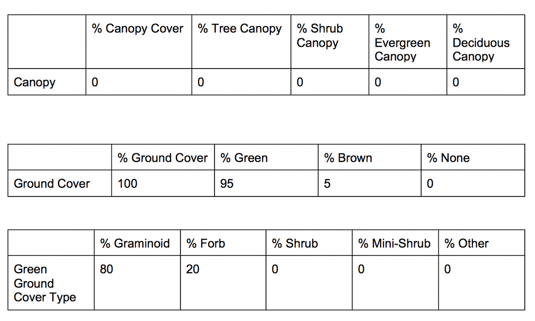 This type of research provides us with both qualitative and quantitative observations about land use and cover change to compare to historical data. This data is imperative for observing trends over a period of time and aids in creating plans to combat those trends. More specifically, our data revealed no such trends. The absence of trends still provides useful information. Seeing that our data is concurrent with the photograph from 1939 demonstrates that the Estate Gardens have been maintained for the past 79 years and will continue to be for the foreseeable future. In manicured areas research such as ours is less descriptive of change than in residential or natural areas.
Lab Group: Rose Mayer and Mason Kirkpatrick Background The measuring of land use and cover change is a method that is common place in modern environmental practice. It is used to measure geographic change on the surface of the earth and more specifically how the use of certain areas has changed over time. The general motivation behind this lab in particular was to observe and assess the land use and cover change of the Lewis and Clark campus, surrounding neighborhoods and natural areas. Based off an aerial photograph of Lewis and Clark’s campus in 1939, our general goals for this lab were to gather data and photographs to use in comparison to the old photograph to generate qualitative results of the change in land use and cover. Rose and I chose to focus on the Estate Gardens of Lewis and Clark since it has been a heavily manicured area of the campus since its founding. By observing the change in land use and cover we can use the data we gather to more accurately observe change in The Estate Gardens. In general observing these types of change can provide details on how land use has changed and how that may impact surrounding environments. Procedure/Analysis First Rose and I chose the Estate Gardens of Lewis and Clark for the reasons stated above. Then using pins flags and our Garmin GPS we were able to map out a 90x90m square that encompassed the majority of the Estate Gardens. Next we were able to calculate the centroid of our square, a 30x30m area in which we marked the center with a pin flag. Lastly we setup our Kestrel Drop within our centroid. The following day we returned to our centroid to collect our gear, making sure to have left the Kestrel there for at least 24 hours. We synced the Kestral to our phones and recorded its data. Possible errors we may have encountered were, firstly our 90x90m square may not have been perfect due to the fact that our tape measurer only could reach 50m. This may have caused our measurements of 90m to be slightly off. Second, our 90x90m area was not perfectly homogenous due to the fact that in order to create a 90x90m area we were forced to traverse into the ravine a bit. This could muddle our observations slightly. Lastly, during the finals hours of collecting data our centroid was heavily trafficked by people because of the Pio Fair. This could lead to unnatural data being presented on the Kestrel during the final hours of collecting data. 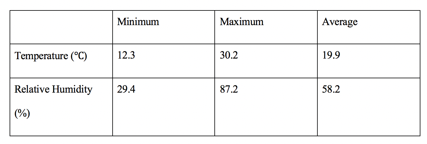 Location of centroid in Degrees: 45.45009 N, 122.66777 W
Centroid estimated error: 7.8 We found this data to be the quantitative results of our 24 hour observation of the Estate Gardens. Discussion Using both our qualitative and quantitative results in comparison to the 1939 photograph we were able to observe the general change over the past 79 years. The Estate Gardens have experienced minimal land use and cover change during this time mostly due to the fact that it had been a heavily manicured area for the college. The only change that can viewed happened outside of our centroid but within our 90x90m area. This being the construction of academic buildings on the fringes of the Estate Gardens. Due to the fact that The Estate Gardens have been manicured consistently since at least 1939 our data does not allow us to make inferences about trends in land use and cover change for the general area. Rather, it allows us to view an area that stands in a middle ground between man made structures and natural areas. Giving us a first hand look at a natural area that has a minimal amount of land use and cover change over an expanse of time while maintaining the fact that it is a natural area. |
AuthorWrite something about yourself. No need to be fancy, just an overview. Archives
December 2018
Categories |
 RSS Feed
